| |
| Note:
The following is used with the permission of the original
author.
|
|
Visual Analysis of Sales, Earnings & Price
-
Estimating Historical Growth
- While this is one of the most crucial areas of the
Stock Selection Guide, the techniques for estimating
historical growth are not that difficult. The key is
to identify consistent trends in the company's growth
over the past ten years.
Before putting pencil to paper,
however, you should look carefully at the graphed
data to see if there are any years which appear
to be abnormal. Perhaps EPS dropped off significantly
in one year, only to rebound the next. In that
case, you might consider that year to be an "outlier",
an unusual, one-time occurrence, and simply not
consider it in your calculations. Circle the point
in question to mark it as an outlier, and continue
with your analysis. Of course, any inconsistency
may be a cause for further research to determine
if there is a significant change in the company's
operations.
To identify the past trends,
use a ruler to draw a trend line to approximate
the average annual growth for both EPS and Revenues,
a single straight line that best "matches" the
points you have already graphed. In this company's case,
you will draw your trend lines all the way from the far
most left vertical line, the 1986 year, all the
way to the furthest right year, 1999. There are
four basic methods of drawing trend lines:
-
The Inspection or Best Judgment
Method
- By far the most common
method of drawing a trend line, the "Best Judgment" method
simply means that you examine the yearly results
and draw a line that best represents the overall
picture of those years. The following is an example
of a trend line for Earnings Per Share drawn
using the Best Judgment method.
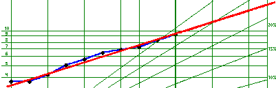
In this case, EPS have been very consistent,
so it is relatively easy to determine the
trend.
-
The Peak Period Method
- This procedure is often used for more cyclical
companies, those whose earnings or revenues
increase to a "peak" and then recede. Find the
two most recent of these peaks and draw a line
that connects them.
-
The Mid Point Method
- This method produces a mathematical result
that will be exactly the same for all who use
it. It requires that you find the average of
the first five data points, plot that point
on the graph, find the average of the last five
data points, then plot that point on the graph,
and draw a straight line that connects those
two points.
-
The Area Method
- To use this method, place your trend line
so that the area between your trend line and
the drawn lines connecting the data points is
equal both above and below the trend line.
- Having drawn a trend line,
you can now measure the growth
rate by comparing this trend
with the graph's pre-drawn
percentage growth lines (marked
5%, 10%, 15% and so on). An
easy way to do this is to measure
the distance between the intersection
of your trend line on the far
left vertical line (the first
year of data) and the horizontal
base line (marked 1). Then
go to the intersection of the
trend line and the most recent
year (the bold vertical line).
Measure down the same distance
as the first year and mark
this point. Now, visually estimate
where this point falls between
the pre-drawn percentage growth
lines (for instance, halfway
between 15% and 20% would be
17.5%). This is the average
rate of historical growth.
Repeat for both EPS and Revenues,
and mark the growth rates you
have determined at the bottom
of the Visual Analysis.
-
Projecting Future Results
- Once you have estimated the
historical growth of the stock
you are studying, you need
to make a decision about the
company's future prospects.
Is growth likely to continue
at the same rate in the future?
Will the company's growth slow,
or even increase from its historical
pattern? Common sense tells
us that good growth stocks
are able to continue their
growth, but they may not be
able to grow as quickly as
they have in the past. It may
be prudent to allow for a slowing
of growth in the future, especially
with high-flying companies
that may find it hard to sustain
their rapid growth.
Now, extend the historical
trend lines, or draw new
trend lines to reflect
your expectation of the
company's future growth.
Draw your new line all
the way from the far left
to the far right margins,
and, as before, measure
the distance to calculate
the future percentage growth.
Record your projections
at the bottom of the graph.
-
Interpreting
the Results
- By
now, you
should have
filled the
Page 1 graph
with a multitude
of lines,
points and
annotations,
and you can
see why using
colored pencils
may be helpful!
But a picture
is worth
a thousand
words, and
you should
now have
a good overview
of the company
you are studying.
Has growth
been very
rapid, or
slow and
steady? Are
there periodic
dips in EPS
that indicate
the company
may be in
a cyclical
industry?
Have EPS
and Revenues
grown at
a consistent
rate, or
are Earnings
growing faster
than Revenues,
indicating
an increasing
profit margin
but hard
to sustain
over the
long term?
Has the stock's
price kept
pace with
the company's
growth over
the years?
You
can also calculate
future EPS mathematically
based on your
revenues projection.
NAIC calls
this the "Preferred
Procedure" because
it can
provide
a more
accurate
EPS figure,
since
Revenues
are typically
more
consistent
than
earnings
for most
companies.
You can see
a more
complete tutorial
about using
the Preferred Procedure.
Your
decision about
the company's future
growth is one
of the most
important judgments
you need to make
to use the SSG
properly. Having
made your
projections,
you
can now
turn
to Page
2 of
the
SSG.
|
|
| |
|
|
*
This site not affiliated with the National Association of Investors
Corporation (“NAIC”) in any way, nor does NAIC
sponsor or endorse this web site or any of the products or
services offered herein.
The author founded a successful investment club and has been a member of NAIC
since 1990.
Stock
Investment Guide, SIG, Portfolio Analysis Review, Comparison
Analysis Review,
CAR, and PAR are trademarks of Churr Software.
|
|